Most often when reviewing approaches to instructional design we think about elearning. How to best present things on a screen, how to break down content, how to make it interactive. There’s a pretty big body of literature that focuses on that (think Mayer et al.) and more often now I’m starting to encounter UX crossover literature for elearning. But not everything IDs create is kept to the screen. We still create so much printed stuff in learning design. Job aids, workbooks, those laminated quick reference cards. I came across this study from Kealey et al. (2023) about redesigning cancer screening pamphlets using UX principles and it got me thinking about how to approach designing print materials from a UX perspective.
The researchers had UX designers and graphic designers redesign health pamphlets across several studies, then tested them with actual users. User testing of elearning is getting more common, but when was the last time you ran a printable PDF past a user?
Materials designed using UX principles scored significantly better on usability measures, which is expected. What I found more interesting was that the individual designer’s approach mattered as much as whether they used UX principles at all. What should also be expected, but feels surprising is that there’s no one “correct” design, which I think is sometimes a trap instructional designers can fall into.
The study identified specific usability problems in the original materials: confusing and missing content (users couldn’t figure out which screening recommendations applied to them), poor visual layout and hierarchy (cluttered content made important information difficult to see), flow and navigation issues (styles were applied but has unclear purpose). The UX-designed versions addressed these issues through a few different approaches. When tested against knowledge transfer users rated the redesigned materials higher for usability, but it made no difference to their knowledge scores or whether they intended to get screened (there are detailed descriptions of the limitations of the study design by the authors). There are of course limitations to how this can be tested, so like a lot of similar research there may still be benefit in taking these approaches, but it’s not a clear cut problem-solution relationship with knowledge and behaviour. If your materials are confusing or poorly organized, you’ve already lost people. They won’t even get to the content. Better usability removes a barrier; it doesn’t guarantee outcomes, but without it you’re starting from a worse position.
This connects to something I see constantly in higher education contexts. We often design materials and courses as if they’re standalone solutions when really they’re one piece of a larger system. The job aid needs to be usable AND supported by the workflow it fits into. The workbook needs good design AND good facilitation. Print materials are part of an ecosystem of learning.
Applicable UX Approaches
Just like with your elearning, watch someone actually use your materials. Not read them, use them. Can they find what they need? Do they understand the terms? I worked on a series of lab activities once that we thought were perfectly clear until we watched students try to follow them. The instructions made sense to us but students got lost at the same every single time because we’d assumed they’d know what “buffer solution” meant in that context. One thing I find helpful with a broad range of materials here is the think-aloud.
Visual hierarchy is important on the screen and it’s no different in print. When everything has equal visual weight, nothing stands out. I see this constantly with materials people bring me to review – dense paragraphs, no clear entry point, everything in 11pt Calibri. You can’t tell what’s important just by looking at it. If the most critical information isn’t the most visually prominent, you’ve got a problem.
Get different kinds of feedback and be clear to your reviewers what kind of feedback you’re looking for. The UX experts in the study caught different problems than end users did. Both found real issues. I try to get at least one colleague to review (expert perspective on content and structure) and then watch someone from the actual audience use it. For bigger works, the more (number and diversity) people I ask to look at what I’m designing, often with specific hopes of what they’ll respond to.
Something that seems to go against a lot of elearning design mantra is that in the case of print, shorter isn’t automatically better. One of the redesigns was actually longer than the original, but performed better with some groups. It just broke content into clear sections (segmenting, or “chunking” if you’re from that generation of IDs) instead of cramming everything together. I fight this battle regularly when there are desired or real limits to the thing I’m trying to design.
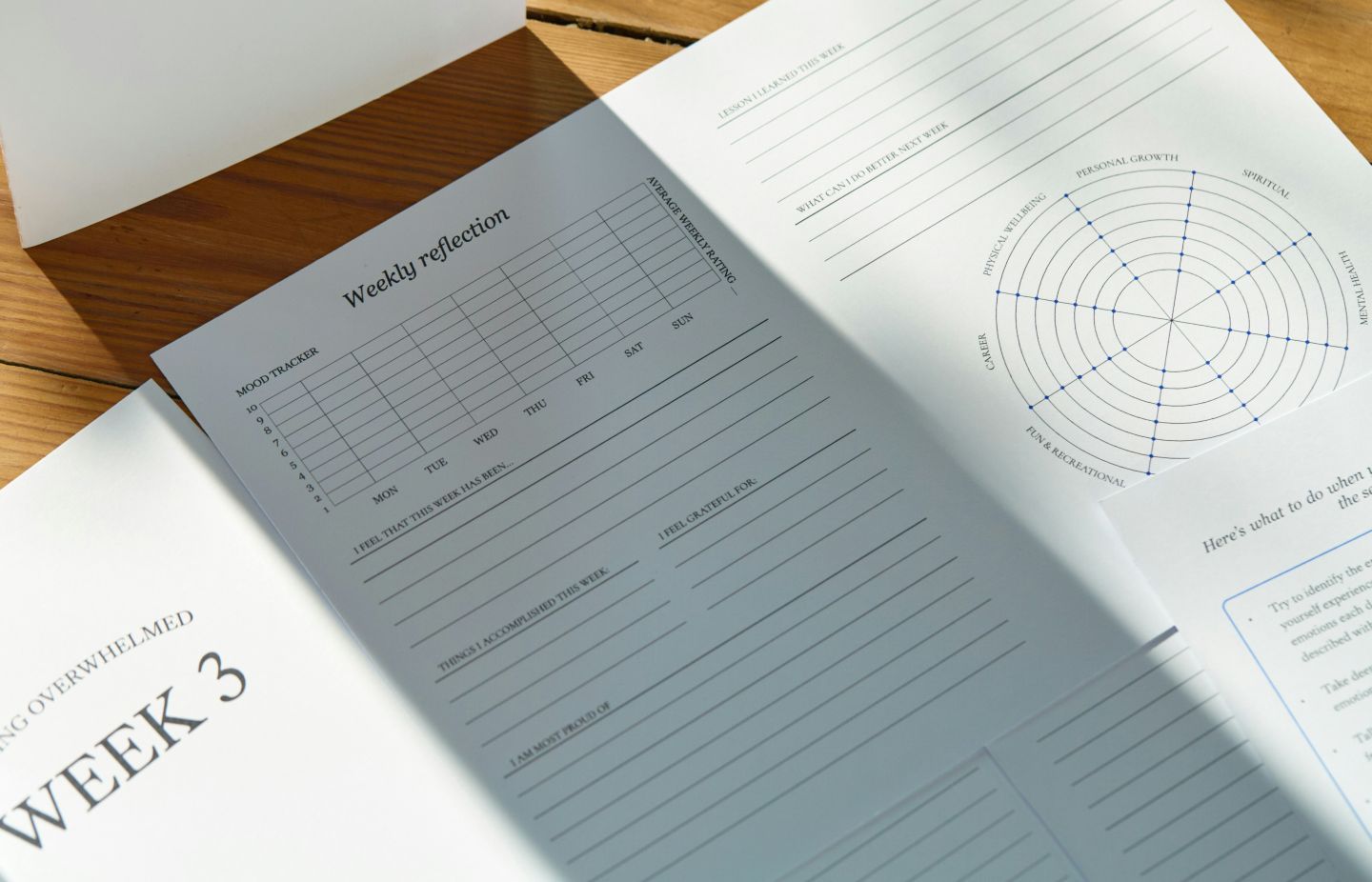
There was a time when the pitch was “everything will be digital”, but even today we make a lot of print materials for a variety of reasons. They’re not disappearing. Job aids, reference guides, workbooks, handouts. They deserve better than “let’s format this in Word and call it done.” Many of the same principles that make elearning usable (clear structure, visual design, user testing) apply to print. We just don’t always remember to use them. Or we run out of time. Or we don’t have the graphic design support.
If you’re working on printed educational materials, what approach are you taking? Are you applying the same strategies as you would for elearning? What challenges are you running into?
Photo by Joonas Sild on Unsplash
Kealey, M. R., Urakami, J., Henderson, K., Chignell, M., & Straus, S. E. (2023). In what ways does user experience design improve printed educational materials? Applied Ergonomics, 113, 104081.